Showing posts with label School. Show all posts

Monday, April 14, 2014

LatinoMed Family Medical Clinic Design


Last semester I took Healthcare Design. The project for this class was to design a medical clinic in Columbus, Indiana for one of three cultural communities: Iraqi, Vietnamese, or Latino. My partner and I were assigned the Latino community and after researching the location and population, we decided to incorporate some mid-century design aesthetics inspired by Columbus, Indiana's Miller House, with much more vibrant and colorful design features that would appeal to the Latino community. Simply named, LatinoMed, incorporates linear skylights similar to those in the Miller House, designed by famous mid century designer Eero Saarinen.  And white walls create a neutral backdrop for an interesting mix of patterned textiles inspired by those used in the Miller House as well as an uplifting imagery of Latino families, and iconic Latino artwork to help the target community feel welcome and comfortable.


A theme through out our design was the tree of life commonly featured in Mexican and Latino folk art. We repeated this symbol in the Chapel wall's stained glass windows, on a wall mural in the children's play area, and on a fountain as you enter the exam room area, as well as in unique suspended radial wood ceiling systems that resemble a canopy of trees.


Moving back into the exam room area, we again utilized the tree of life theme to create a wayfinding feature along the floor where branch like paths guide the patients to exam rooms.  Nursing stations incorporate interesting reclaimed wood succulent planter boxes for interest and chairs are upholstered in a green material to promote ideas of growth, health, and a sense of calm.


Overall I think we developed a very sucessful design that is warm and inviting for the Latino Community, but still clean and modern and Miller House-inspired.

What do you think?

Tuesday, December 31, 2013

Taking the Plunge: Ever-Evolving Portfolio Additions

I hope all you readers had a lovely Christmas! I certainly did.  And now its back to work!  I'm still on the job hunt and as you know, still in school. So with my most recent residential design project complete, I've added a few more pages to my ever-evolving portfolio.  Using the same format that I showed you before, I dismantled the boards I put together for school and re-created them on these lovely (11x17) pages...


Friday, December 13, 2013

Final Residential Design Boards

Woo Hoo!  The last class of the semester was last Thursday so I'm a free woman now! I absolutely love school, but after obsessing over a project for 12 weeks, I'm exhausted and ready for a break.  Hopefully I'll learn to better balance things when I'm actually working in the field. :/   We'll see.

I spent a week or so before finding the final pillow and drapery trims, working on renderings of each spaces, putting together digital boards, and mounting fabric samples. Last Thursday we had to do our final presentation of our projects, which went really well. We had a really talented class and it was so interesting to see everyone's final product.  

Here are some photos of my labor of love...


And yippy skippy, my project got chosen for the hall of fame! There should be photos up of my boards along with two other projects from my class up on our school's Facebook page at some point.


Tuesday, November 19, 2013

Residential Design Process Boards

 I've been sharing with you the process of my residential design project for school.  With adjacency matrices and bubble diagrams I nailed down the floor plan; then refined the furniture in the space plan and tweaked other architectural details, sketching along the way to get a better idea of how the space would feel.

A few weeks ago we had to pull together our work thus far on two "process boards."  Not only did these boards show the, you guessed it, process of how the design has come about, but they also give an idea of where we are headed with the design.  It was just fascinating to see all the different designs coming about from modern and mid-century to colorful transitional and art-deco-inspired to traditional (like mine). There are so many talented students in my class! It's really a pleasure learning from them as well as the teachers.

Anyway... here's how mine turned out...


My fictional clients are music mogul and successful business owner Jack Sanborne (the lead character in the movie Something's Gotta Give), his wife Karen, a food writer (the character in the play "Dinner with Friends," their 16-year old daughter Taylor (Swift), and Malcolm the dog.  In order to meet the families needs and desires, I've chosen to go for a classic, refined, and elegant traditional look. Articulated architectural details like wall paneling, archways and parquet floors will set the stage for a collection of french antiques and newer furniture pieces as well as art and accessories from the family's travels.

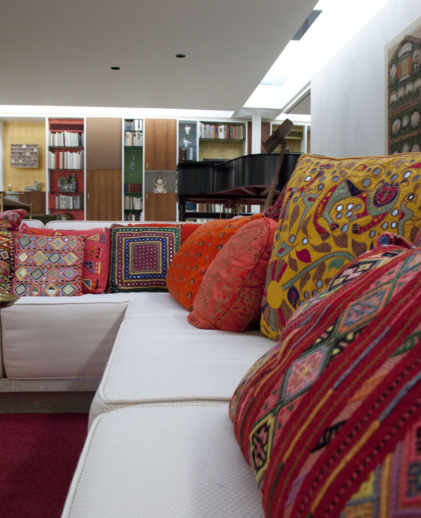
As you enter, I've created a formal foyer and living room with 20 foot ceilings to add an impressive sense of luxury, since Karen likes to keep up appearances, but an inviting color palette of mostly creams, pale blue, and green will keep the space feeling comfortable and understated.  The living room flows nicely into the dining room, where I plan on doing a lovely muted scenic wallpaper with a pop of red on dining room chairs, which will coordinate with art and some pillows in the living room, to liven up the home.  This space will also be great for the dinner parties the family will host with direct access from the dining to kitchen for ease of use.

Jack was given an office down stairs because he does work from home often. The space will also serve as his "man-cave" with his own TV and masculine stained wood walls, and color palette of brown and deeper blue, his favorite color.  I've also included a murphy-bed in the office to accommodate any overnight guests they might have and provided a shower in the powder bath downstairs for those guests.

As you move to the back of the first floor you enter a more casual space with informal family room adjacent to the open kitchen where the family can relax and watch TV, Karen can cook or do some writing on her laptop in the cozy breakfast nook, and Malcolm can hang out on his dog bed.  And that space opens up to a highly functional patio with a lovely fountain, comfortable seating, a bbq and table for dining outdoors on a lovely summer night.

Next you have the second floor...


The colors upstairs will be an edited version of the palette downstairs with only the soothing light blues and greens and warm wood furniture and floors for a very relaxing environment.

The stairs come up to a landing with a peek-a-boo opening to the living room below and an ample storage closet.  To the left there is a laundry room and to the right, Taylor's room with canopy bed, chaise lounge and a desk for her to do her school work.  She has her own bath and walk-in closet and a lovely view out the floor-to-ceiling windows.  Straight ahead, through the grand double doors is the luxurious master bedroom with TV above a fireplace and a cozy seating area with ottoman. The chairs will be on casters so that Karen can flip around and use the tucked-away desk to do her writing.  I've also given them a large his and hers closet, and lovely master bath with floating mirrors above the sinks, a freestanding tub, bidet and toilet in a private room, and a vanity area for Karen.

Now I'm well on my way to picking materials, furnishings and accessories.  We have to fully design three rooms in the home for our presentation boards so I'm doing the living room, dining room, and master bedroom. But of course, I cant help wanting to do it all and have already picked out fabric for the other rooms as well. But I'll share that with you next time.

Friday, November 1, 2013

Design Sketches

Hope everyone had a happy and fun Halloween!  I spent mine in class in my yellow crayon costume. Fun times! Anyway... I had to present my process boards for my Residential Project and thought I'd share with you guys some of the sketches I've done for my project.

Sketching is an amazing tool to be able to communicate your design ideas to a client.  I also find it really helpful in the design process to get a better idea of what a space plan will look like in 3-D... especially when I want some interesting architectural details goin' on like I do in this project.  If you follow me on Instagram or Facebook, you've probably already seen these, but I thought I'd share in blogland as well.  Hope you enjoy!

Foyer

Formal Living Room

Master Bedroom


Master Bathroom

And if you haven't already, check out the inspiration photos in my last post or on Pinterest board.

Tuesday, October 22, 2013

Residential Design Project Inspiration

So I've been pinning away and getting inspired for my residential project for school.  I'm going for a traditional look that incorporates articulated architectural detailing, classic finishes

We're supposed to have one inspiration photo for our process board which will be due in the next couple weeks. I'm not sure how I'll narrow it down, but I though I'd share with you guys my inspiration.  And feel free to check out more on my Pinterest board.

Enjoy!


source


Monday, October 14, 2013

Taking the Plunge: Putting Together Portfolio

I told you I'd get back to the "Taking the Plunge" series I started, so here I am!  Today I'll tell you/show you how I put together what I call my "Draft" Portfolio.  If you're looking for a job in the interior design industry, a portfolio is something you will absolutely need. But what do you do if you haven't finished school and don't have any "real" projects to include?  At my school we have a class as part of the Bachelor's program where they teach how to put a portfolio together and help you refine yours. But that class is at the end of the program, so what about us folks who aren't that far along in school and want design jobs? What do we do?  Here's what I did...

As always, Google is your friend. I did some internet research on "interior design portfolio" and also thumbed through a book on the same subject in my school's library.  From what I could tell, it looked as though students basically "deconstructed" their digital design board and reformatted each project to a more manageable size, like 11"x17" (or a spread of 2 11"x17" sheets), to be added to a portfolio book. Another common thing I noticed was a consistent graphic design across all pages to pull the projects into a cohesive book... basically like a letterhead with some type of header/footer.

So I followed their lead and deconstructed my own digital design boards and reassembled them in 11x17 format. I made sure to include sketches, floor plans, fabirc and major furnishing choices to give the overall idea of each project.  While I did this for all of my digital boards, I didn't have the time to do this for my first board which wasn't digital since it would have required finding all the images angain.  Instead, I just included photographs of the boards.  I also made a point of including some sketches, CAD drawings, etc. to show a variety of skills as well as the process of my designs. I did also  utilize the idea of a consistent header/footer graphic and created a simple stripe at the bottom and top of each page along with the double arrow (from the blog) next to each heading.

I created the whole thing in Adobe InDesign had it printed on 11x17 paper. I used brads to hold it together so that I could switch around the order or add/remove pages depending on which employer I was showing it to.

It still could use a lot of editing and refining, and will eventually have quite a few more projects in it... heck, I may even change it all together when I'm in the Senior Show class! But for now, it works.


Thursday, September 26, 2013

Back to the Grind... the good Grind

I'm happy to say that I'm back to school since the week before last.  I really love it!  I'll get back to "Taking the Plunge" next time with a little info on how I put together my portfolio, but for now, I thought I'd give you a little update of whats up design-wise in my life right now since I've gotten a bit behind.

This quarter I'm taking Residential Design and Business Principles.  So I'll be designing a New York apartment for charismatic music mogul and business owner Harry Sanborne (Jack Nicolson's character from Something's Gotta Give), his food critic wife Karen (from the play Dinner with Friends), and Taylor Swift.  Just turned in my client profiles, design concept and design program last week and am looking forward to designing a comfortable traditional home to add something a bit different to my portfolio.

In the mean time, at Dwellings Design Group, we've been working on a modern remodel overlooking the back bay.


A bathroom and kitchen remodel, as well as redecorating a home with a pottery barn look.


And some other little jobs here and there. So I've got quite the variety of design in my life right now. And I love it!


Monday, August 19, 2013

Taking the Design Plunge: 5 Tips for Interior Design School

Recently, a reader emailed me asking how I went about "taking the plunge" into an interior design career from a career that is so different: Civil Engineering. I've been meaning to write about this for a little while now, so I was happy to be reminded. This "Taking the Plunge" series of posts will share details of how I worked my way into the field of design. I still have quite a ways to go, but I figure, why not share it with ya'll while it's current and fresh on my mind. Hopefully this can be a helpful to anyone else looking to change careers to pursue a passion. It is by no means the only way to go about transitioning; this is simply my experience.

As most of you probably know (if you've read the About Me section), I started out by searching out and enrolling in interior design school.  I felt that for me to be confident in my future career, I needed the education to back it up.  I looked at a few different schools that were CIDA accredited--that's the Council for Interior Design Accreditation.  I wanted to go somewhere that had a reputable program.  Finally, I decided on Interior Designers Institute because it was accredited, close to my house, and slightly less expensive than others I looked into.

I went into school excited and interested.  I've been quite successful in it thus far, so I thought I'd share with you a few ideas that I developed from the beginning, which I believe have helped me.

  1. Don't worry about grades. I'm not in school to get a good report card like I was in elementary school.  I enrolled in design school to learn information and how to apply it and to exercise and hone my design skills.  The learning is the important part to me, not the paper transcript. So I don't think about my grades.  And what'dya know... the grades that have followed as a result of that attitude couldn't be better.
  2. Treat each teacher as your client.  We usually have to make up a fictional clients for school projects, but I always think of my teacher as the client since they are evaluating the work.  If they have input, I take it; if they don't like something, I change it.  I do my best not to take things personally and figure it's good practice for dealing with clients in the future.  I also keep in mind that there are so many different ways to design something well, so I need to be flexible and not get stuck on doing something one way.
  3. Learn from your peers.  I always look around at other student's work.  There are many talented people at school, so I try gather as much inspiration as possible.  I love seeing the way that different people approach projects and their unique visions.  It helps me expand my ideas about design and look at projects in different ways, which might help me to think of better design solutions.
  4. Be the best you can be; don't try to be THE best.  Some people might disagree with me here, but for me, trying to have a little humility goes a long way.  I must admit, I'm human and pride does get me at times, but I do my best to stifle it.  Design is such a subjective matter; there really is no "best."  I try not to think of school as a competition and instead remind myself of #3... instead of being stuck on trying to be the most awesome, I remind myself that others have awesome ideas as well.   I appreciate the work of my peers, let myself be inspired by them, and do the best that I can on each individual project with the "client" in mind.  
  5. Be of service.  I think helping my peers feeds the soul. Like I said... it's not a competition. I don't hesitate to share ideas, information and assistance whenever possible.
Armed with these objectives, I think you're bound to maximize your success. Now, go get 'em design students!

Coming up in the series, I'll share about...
  • how to revamp your resume for design,
  • putting together a portfolio (quickly), and
  • searching and interviewing for jobs.

Friday, June 21, 2013

Handsome Elegance {Residential Lighting Project}

Remember all that lighting stuff I was talking about a few weeks ago?  Well all that research and obsessing was part of my crazy process to develop a design for my lighting class. Although the class is about lighting and not all the other details of design, we had to come up with a style for our space in order to pick coordinating light fixtures.  And, of course, my obsessive mind takes things a bit overboard and has much much more figured out than just a style and light fixtures.  I began collecting inspiration photos on Pinterest like a mad woman and came up with a glamorous, yet masculine theme, which I have called...

Source

My fictional client is a wealthy gentleman who has a mixture of vintage family heirloom furniture as well as some modern pieces that he'd like to display in a space that similarly mixes traditional and modern elements to create a luxurious, masculine space with a touch of feminine glamour.  To that end, I've designed custom built in cabinetry throughout the space, a coffered ceiling in the living/dining area, and detailed tray ceilings in the entry, kitchen, and bedroom.  Here are the electrical and lighting plans that show the layout of the space, furniture, lighting and ceiling design...


And below are elevations of the custom built-in units and kitchen that I designed. This is my first experience doing elevations and details and I don't really have much knowledge of how ceilings are built, but my teacher thought I had previous experience so I guess they're pretty legit (in the slang sense of the word).  Too legit, too legit to quit! Haha...

All the cabinetry is shaker style to bring in a little modern simplicity, but is finished with crown moulding and high baseboards for a more traditional look.  A mix of rich materials from marble, to wood, to copper, stainless steel and brass create interest and a feeling of extravagance.  And my lighting selection below continues the mix of metals, of modern and traditional, of masculinity and femininity for an overall design that is handsome and elegant.

What da ya think?  I'm pretty happy with the way everything turned out and wish this was a really project that I could see realized, but I suppose I'll get that experience in the future (not for this exact space of course).  We presented our designs in class last night and everyone had really nice designs with different styles. Our teacher was so impressed, she took every student's board for the "hall of fame," which never happens, especially with a teacher who's pretty critical!  Next we'll be working the lighting/ceiling design of a commercial space.
In the mean time, I do have something special coming up... something I've been telling you I'd show you for quite a while. I finally took photos of my mom's TV room!  I'll be posting them on Monday, so come back and check it out!