From this little yellow crayon to you!
Thursday, October 31, 2013
Tuesday, October 22, 2013
Residential Design Project Inspiration
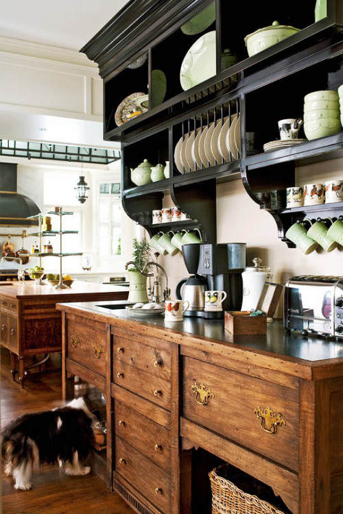
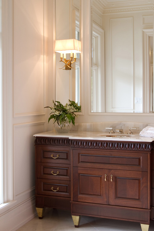
So I've been pinning away and getting inspired for my residential project for school. I'm going for a traditional look that incorporates articulated architectural detailing, classic finishes
We're supposed to have one inspiration photo for our process board which will be due in the next couple weeks. I'm not sure how I'll narrow it down, but I though I'd share with you guys my inspiration. And feel free to check out more on my Pinterest board.
Enjoy!
We're supposed to have one inspiration photo for our process board which will be due in the next couple weeks. I'm not sure how I'll narrow it down, but I though I'd share with you guys my inspiration. And feel free to check out more on my Pinterest board.
Enjoy!
source
Monday, October 14, 2013
Taking the Plunge: Putting Together Portfolio
I told you I'd get back to the "Taking the Plunge" series I started, so here I am! Today I'll tell you/show you how I put together what I call my "Draft" Portfolio. If you're looking for a job in the interior design industry, a portfolio is something you will absolutely need. But what do you do if you haven't finished school and don't have any "real" projects to include? At my school we have a class as part of the Bachelor's program where they teach how to put a portfolio together and help you refine yours. But that class is at the end of the program, so what about us folks who aren't that far along in school and want design jobs? What do we do? Here's what I did...
As always, Google is your friend. I did some internet research on "interior design portfolio" and also thumbed through a book on the same subject in my school's library. From what I could tell, it looked as though students basically "deconstructed" their digital design board and reformatted each project to a more manageable size, like 11"x17" (or a spread of 2 11"x17" sheets), to be added to a portfolio book. Another common thing I noticed was a consistent graphic design across all pages to pull the projects into a cohesive book... basically like a letterhead with some type of header/footer.
So I followed their lead and deconstructed my own digital design boards and reassembled them in 11x17 format. I made sure to include sketches, floor plans, fabirc and major furnishing choices to give the overall idea of each project. While I did this for all of my digital boards, I didn't have the time to do this for my first board which wasn't digital since it would have required finding all the images angain. Instead, I just included photographs of the boards. I also made a point of including some sketches, CAD drawings, etc. to show a variety of skills as well as the process of my designs. I did also utilize the idea of a consistent header/footer graphic and created a simple stripe at the bottom and top of each page along with the double arrow (from the blog) next to each heading.
I created the whole thing in Adobe InDesign had it printed on 11x17 paper. I used brads to hold it together so that I could switch around the order or add/remove pages depending on which employer I was showing it to.
It still could use a lot of editing and refining, and will eventually have quite a few more projects in it... heck, I may even change it all together when I'm in the Senior Show class! But for now, it works.
Subscribe to:
Posts (Atom)


